
Echarts 相关
Echarts 地图的 JSON 文件中各个字段的含义
coordinates: 用逗号分隔的一个个UTF-8字符串,每个字符串都是一片区域
childNum: 多边形区域数量
encodeOffsets: 是解压需要的信息,跟 coordinates 一一对应
问题来源:在海南省地图 JSON 文件里添加三沙区域,并保持地图较大的可视区域
知识来源: https://github.com/apache/echarts/issues/3308
legend 固定列数且对齐
效果: 
代码:
js
legend: [
  {
    bottom: 20,
    icon: 'circle',
    orient: 'vertical',
    left: 50,
    data: top10Legend.slice(0, columnItemCount),
    itemWidth: 20,
    itemHeight: 14
  },
  {
    bottom: 20,
    icon: 'circle',
    orient: 'vertical',
    right: 50,
    data: top10Legend.slice(columnItemCount, top10Legend.length),
    itemWidth: 20,
    itemHeight: 14
  }
],

// 其中 top10Legend 为 ['石油、煤炭及其他燃料加工业', '电气机械和器材制造业', ...], columnItemCount 为 Math.floor(top10Legend.length / 2)
markline
html
<!DOCTYPE html>
<html lang="en">
  <head>
    <meta charset="UTF-8" />
    <meta http-equiv="X-UA-Compatible" content="IE=edge" />
    <meta name="viewport" content="width=device-width, initial-scale=1.0" />
    <title>Document</title>
    <script src="https://cdn.jsdelivr.net/npm/echarts@5.4.3/dist/echarts.min.js"></script>
  </head>

  <body>
    <div id="chartContainer" style="width: 600px; height: 400px;"></div>

    <script>
      var data = [
        { name: 'Category 1', value: -10 },
        { name: 'Category 2', value: 20 },
        { name: 'Category 3', value: -5 },
        { name: 'Category 4', value: 15 },
      ];

      var sum = 0;
      for (var i = 0; i < data.length; i++) {
        sum += data[i].value;
      }
      var average = sum / data.length;

      var chartOptions = {
        xAxis: {
          type: 'value',
          axisLine: { show: false },
          splitLine: { show: false },
        },
        yAxis: {
          type: 'category',
          data: data.map(item => item.name),
          axisLine: { show: false },
          axisTick: { show: false },
        },
        series: [
          {
            type: 'bar',
            data: data.map(item => item.value),
            itemStyle: {
              color: function (params) {
                return params.value >= 0 ? 'green' : 'red';
              },
            },
            markLine: {
              lineStyle: {
                type: 'solid',
                color: '#000',
              },
              label: {
                fontSize: 16,
                color: this.mainColor,
              },
              symbol: 'circle',
              symbolSize: 5,
              symbolOffset: [-1, 0.5, 0, 0],
              data: [{ type: 'average', name: 'Avg' }],
            },
          },
        ],
      };

      var chartContainer = document.getElementById('chartContainer');
      var chart = echarts.init(chartContainer);
      chart.setOption(chartOptions);
    </script>
  </body>
</html>
条形图如何隐藏 y 轴方向上的 0 刻度线
如何将下图圈起来的线隐藏起来? 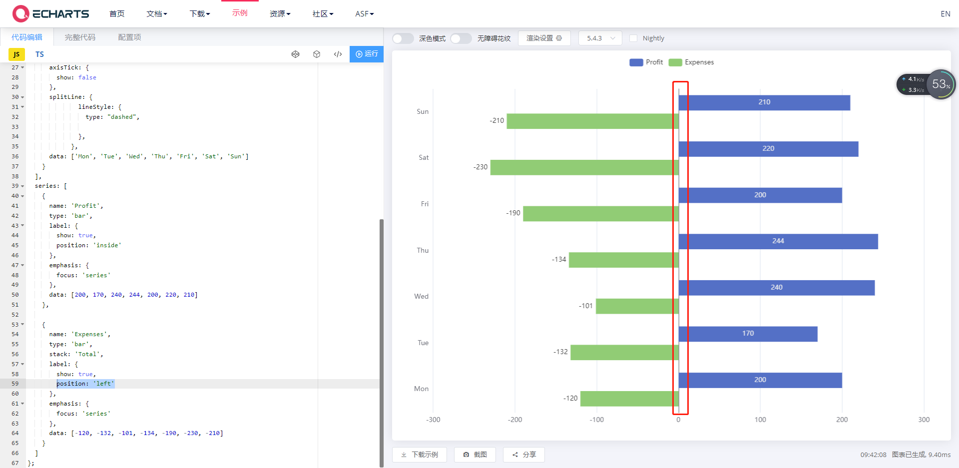
设置 y 轴的 axisLine 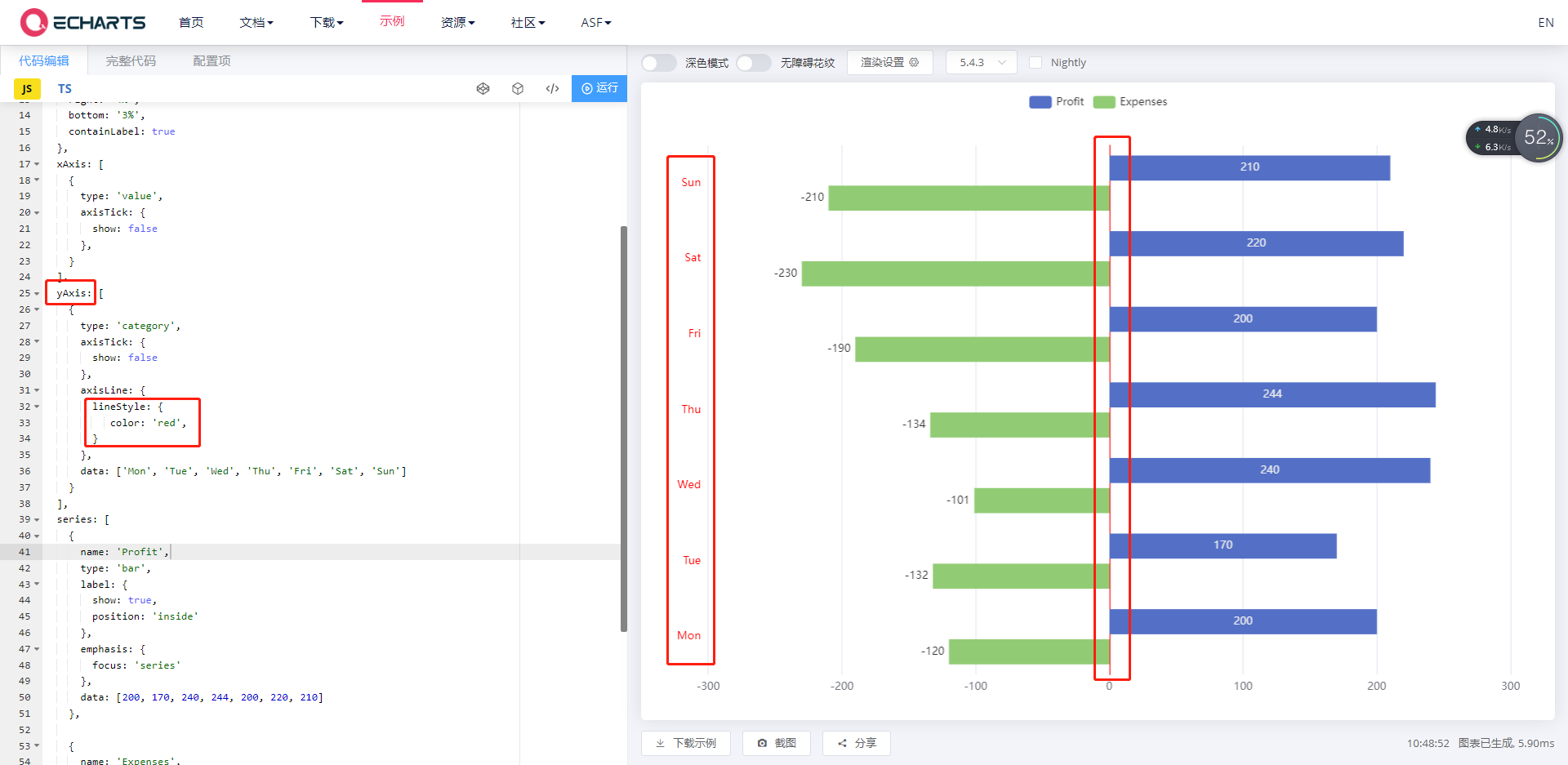
最终代码:
js
yAxis: {
  type: "category",
  axisLine: {
    show: true,
    lineStyle: {
      color: '#fff',
    }
  },
  // 重新定义类目轴上文字颜色
  axisLabel: {
    color: '#000'
  },
}
基于 vue2 封装 echarts 常用组件
- 封装 Chart 组件
vue
<template>
  <div id="chart">
    <div ref="echartRef" :style="chartStyle"></div>
  </div>
</template>

<script>
import * as echarts from 'echarts';
export default {
  components: {},
  data() {
    return {
      chart: null
    }
  },
  props: {
    option: {
      type: Object,
      default: () => {},
    },
    chartStyle: {
      type: Object,
      default: () => {
        return {
          width: '600px',
          height: '300px'
        }
      },
    }
  },
  computed: {},
  created() {},
  mounted() {
    this.chart = echarts.init(this.$refs.echartRef)
    this.chart.setOption(this.option)
  },
  watch: {
    option: {
      handler: function (newOption, oldVal) {
        this.chart.setOption(newOption)
      },
      deep: true
    }
  },
  methods: {

  }
}
</script>

<style scoped lang="scss">
</style>- 新建配置文件 option.js
js
export default {
  tooltip: {
    trigger: 'axis',
  },
  legend: {
    data: ['园区累计企业数', '园区累计新增注册企业', '园区新增企业'],
  },
  grid: {
    left: '3%',
    right: '4%',
    bottom: '3%',
    containLabel: true,
  },
  xAxis: {
    type: 'category',
    boundaryGap: false,
    data: ['1月', '2月', '3月', '4月', '5月', '6月', '7月', '8月', '9月', '10月', '11月', '12月'],
  },
  yAxis: {
    type: 'value',
  },
  series: [
    {
      name: '园区累计企业数',
      type: 'line',
      stack: 'Total',
      data: [120, 132, 101, 134, 90, 230, 210, 101, 134, 90, 230, 210],
    },
    {
      name: '园区累计新增注册企业',
      type: 'line',
      stack: 'Total',
      data: [220, 182, 191, 234, 290, 330, 310, 191, 234, 290, 330, 310],
    },
    {
      name: '园区新增企业',
      type: 'line',
      stack: 'Total',
      data: [150, 232, 201, 154, 190, 330, 410, 150, 232, 201, 154, 190],
    },
  ],
};- 使用
vue
<Chart :option="option" :chartStyle="{ height: '300px', width: '1200px' }"></Chart>